
White paint is white paint, right? Well, in reality, there’s a million different nuances to consider when choosing white for your walls or ceilings that will affect how your paint colour makes your decorated room feel. The wrong white can feel harsh, cold or stark, for example, or it could even play a trick under the natural light of your room and start to look a completely different shade.
‘White it is a hugely popular shade that is widely used, but finding the right shade of white for your project is a nuanced process and can often be very difficult,’ echoes Ruth Mottershead, paint brand Little Greene’s Creative Director. ‘You can use different whites to create an environment that feels soft, warm and cosy or fresh, cool and focused.’
So, with so many options out there, how do you approach choosing a white paint successfully? Here, Little Greene’s colour expert offers their best advice, and suggests tried-and-tested shades for every room in the house.
Avoid the common pitfalls of white paint

Ceiling & Window: Loft White 222
Walls & Brickwork: Re:mix Joanna 130
You might think that choosing white paint is the ‘safe’ option for decorating your home, after all, choosing a white is a lot less scary than committing to a vibrant colour for your walls. Yet, there are still some classic mistakes that many people make when picking out a white paint.
‘Many people opt for brilliant white within their scheme’ Ruth tells us, ‘but this can often have the effect of creating a harsh, clinical atmosphere due to its blue undertones.’
‘Another one of the biggest pitfalls is thinking you must paint the ceiling in brilliant white,’ Ruth adds. ‘This draws the eye upwards, bringing attention to the ceiling as soon as you enter the room, due to the strength and brightness of the shade.’
If you’re looking for something like brilliant white, consider something bright, but without the harsh blue tinge from Little Green's white paint range – Shirting, for example, is one of their brightest with a crisp, clean feel that doesn’t feel cold. Otherwise, look to warmer-toned whites, both for contemporary and more traditional looks.
‘Warm whites with a little umber, ochre, red oxide or green undertones soften white shades and make them much easier to use,’ Ruth says, ‘creating a gentler environment.’
Why undertones matter

Linen wash 33
You might hear talk of undertones of paint, but what exactly is one? Well, while your white paint might, on the surface, just seem white, it’s made up of a variety of hues which subtly influence how your colour reads. Your white may have an undertone of any colour, but it’s most important to figure out whether it’s warm or cold.
‘This is because it’s important to choose a white that complements other colours within the scheme,’ Ruth says. ‘Warm whites combine well with warmer tones such as yellow, oranges and pinks, whereas cooler whites are more harmonious with blues. Whites with a mid-tone complement greens very well.’
It’s not to say you can’t use cool whites - the likes of Little Greene’s cooler Loft White and Gauze actually work brilliantly in minimalist interiors, or paired with strong greens and blues, but warm whites are easy to coordinate with natural wood and floors and gently uplift a space. Hues like White Lead and First Light are warm-to-bright white options, while Stock, Clay and Linen Wash are more muted.
‘A tinge of pink can also make whites feel warmer, creating an inviting atmosphere,’ Ruth adds. ‘China Clay and Rolling Fog – Pale are great options here.’
How to sample white paint successfully

Ceiling: Portland Stone– Pale 155
Upper Walls: Portland Stone – Light 281
Dado Rail, Door & Trim: Portland Stone 77
Cupboard: Dark Brunswick Green 88
White can be a particularly challenging colour to choose because of how it changes in different light. With that in mind, you need to consider the way your room’s facing when making a paint colour choice.
‘Warm whites work particularly well in north-facing rooms or in places you want to create a sense of comfort, like a bathroom or bedroom,’ Ruth explains. ‘Cool whites can work well in south-facing rooms where the light is warmer, or in places like home studies where you want to create a sense of focus.’
It’s also worth noting that a white can read very differently depending on what colours it’s seen next to. This means both your painted sample might be affected by the colour already on your walls, and then in your eventually-decorated room, the colours around it may cause your white to read differently.
To get the best indication of how your white will look, you need to order paint samples. Paint a range of samples out onto A4 sheets and view them in situ throughout the day, in both natural and artificial light. Try to do this in both isolation, and alongside the other colours you’re looking to include in the space.
‘Also, pay consideration to artificial light,’ Ruth adds. ‘A yellow light alongside warm white will make the room feel even warmer, while blue light paired with cool whites will have the opposite effect.’
Of course, this guidance is here to do just that - guide you. ‘Use your natural intuition to select the shade of white that you feel looks best in the space and will achieve your desired look and ambience,’ Ruth says. When it comes down to it, if you love the final result, it’s been a successful project.
-
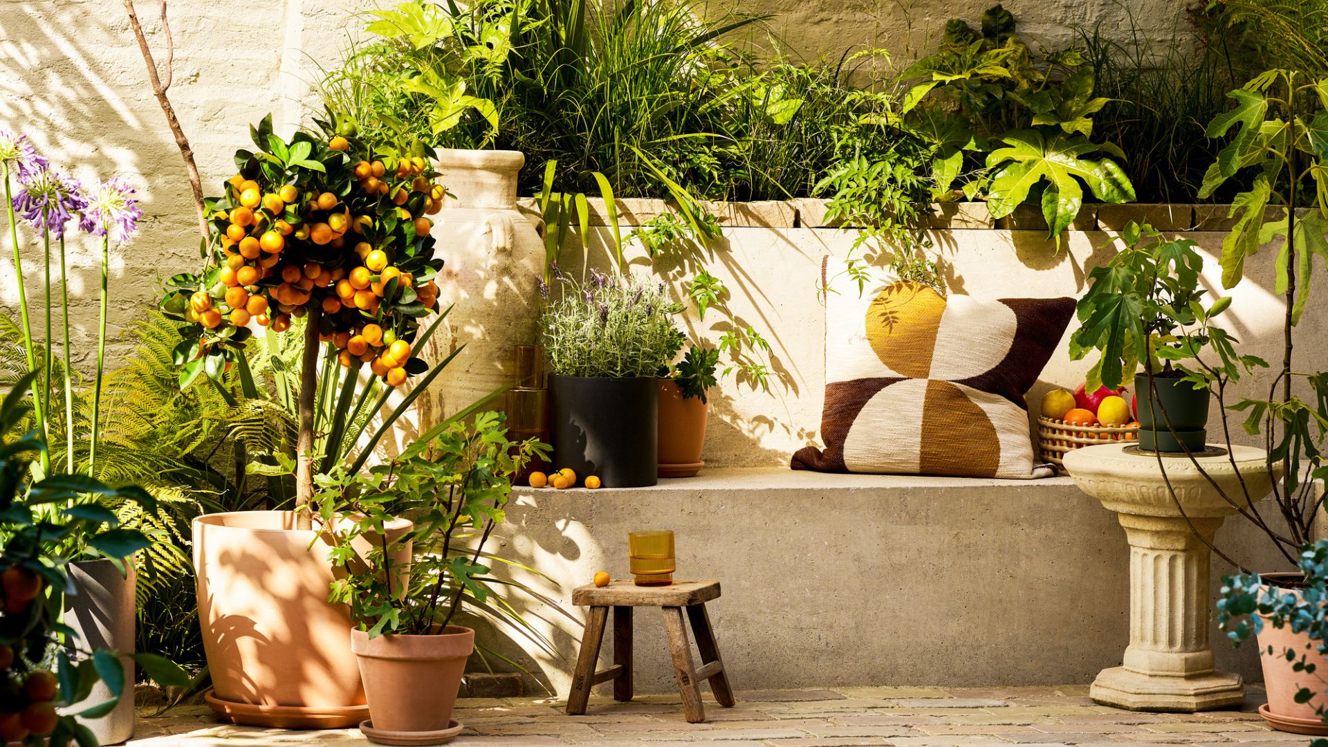 The 'Mediterranean Modern' Aesthetic — Why Designers Say the Potted Citrus Is the Ultimate Status Symbol
The architectural form and delicate fragrance of potted citrus trees enhance any outdoor space, and bring to mind sun-drenched lemon-planted terraces in the Mediterranean
-
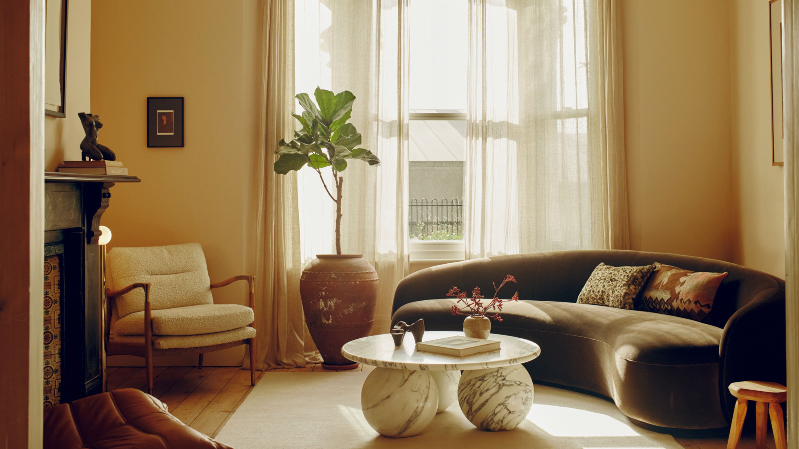 10 Ways to Style a Brown Sofa Like an Interior Designer — How Experts Enhance a Living Room With This Rich-Hued Focal Point
These designer-styled living rooms are favorites from the Livingetc archives, and prove the enduring appeal of a brown sofa, whatever your style or size of space

