I Tested Out All These 'Sage' Paint Colors — Here's Which Ones I'd Pick for Walls, and What Differs in This Color From Brand to Brand
Sage green is timeless, stylish, and completely grounding, but what's the best version to bring into your interior?

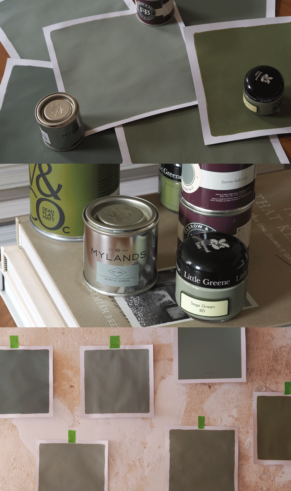
Sage green has become one of the most well-known and well-loved interior paint colors. It offers that cool, calming, neutral-like aesthetic and keeps a strong, timeless appeal. However, despite its staying power, sage green has definitely traversed a few hills and valleys in the past couple of years. Whether or not sage green is out of style has been heavily dissected, as well as what a more contemporary version or application of this color looks like. So to get a better sense of the current sage green paint colors on offer, I thought I would try a few myself.
As mentioned, decorating with sage green is classic, stylish, and dependable, but color is also nuanced. Certain shades of sage green can lean heavily into white tones, while others appear darker and moodier. Of course, this has something to do with the light in the room, but also with the color itself. So, I had a look through some of the best paint brands to see what shades of green fall under the sage umbrella, and tested a few swatches to see what they look like off the screen and in real life.
The biggest takeaway was that most of these shades are quite similar in appearance, with only subtle differences in undertone or tint. With sage, it's about how and where you use it. So, below is a list of different sage green shades, some that are very popular and some that teeter into other green territories, and how they translate when put to the paintbrush. Ready to reclaim your love of sage green?
1. Green 02 by Lick

Green 02 by Lick is one of those green paint shades that is classically 'sage'. It has darker gray and blue undertones, but still feels light and serene. Or, as the brand says, it evokes a "contemplative, soothing, connected to nature" feeling.
When it comes to testing the shade, Lick offers peel-and-stick samples rather than a tester pot, but they give you a very good understanding of what the shade will look like on your wall. Plus, the brand's site has a detailed guide on where this green works best — whether you are planning a paint color for an east- or south-facing room and what shades pair well with Green 02.

2. Sage Green by Little Greene

Image credit: Future

Image credit: Little Greene
What could be more 'sage green' than a paint shade aptly titled 'sage green'? And while this may seem like a simple connection, sage green has a rich history in interiors that gives it its nuance. Which is why this shade from Little Greene feels perfectly in tune with both the heritage side of sage and its deep connection with bringing nature indoors.
Interior designer Laura Stephens, who has used this shade in multiple projects, says, "Sage Green by Little Greene is a shade I return to time and again for its balance of subtlety and sophistication. It brings in that connection to nature, feels timeless, and works beautifully with wood and natural textures."
It's soft enough not to overwhelm a space (which boosts versatility), but deep enough to clearly define different moments throughout a home. Little Greene's tester pots were also very easy to use. The twist-off caps mean you can reseal them easily, and the formula was soft and silky.

3. Hillside by Little Greene

Image credit: Future

Image credit: Little Greene
Now, Hillside by Little Greene is a variation of sage that veers from the beaten path a bit. Online, especially, this shade of green comes across as way bolder, more akin to contemporary olive green color trends. However, once I cracked open the test pot, I found that this wasn't necessarily as intimidating a color. In fact, it definitely read as a more modern sage.
Hillside is part of Little Greene's new paint color selections for 2027, and the brand refers to it as a warmer version of its Sage Green shade — "the perfect green for adding warmth to cool living rooms and functional kitchens." After painting a swatch, I'd describe it as a sage with more bite.
And speaking of history, Hillside is rich with it. "Hughenden Manor in Buckinghamshire, the 19th-century home of British Prime Minister Benjamin Disraeli, was inherited by his nephew Coningsby, who converted Disraeli's drawing room to a library, where this colour was used on small sections of plaster wall, among well-stocked bookshelves. In the 1940s, the library housed a secret wartime Intelligence base that supported a covert RAF initiative, codenamed ‘Hillside’." A tidbit on the Little Greene site that immediately intrigued me.
It's a modern heritage paint color, if you will, and perfect for 2027 decorating.

4. Myrtle Green by Mylands

Image credit: Future

Image credit: Mylands. Laura Sawyer.
For those who want to introduce a softer, but still grounding sage in their home, Myrtle Green by Mylands is a fabulous way in.
This shade was reintroduced to the brand's catalogue from its archive books, so you know that there is a timeless quality to it, although muted and more serene than other variations. It introduces a calm and reassuring sense of stability "that complements architectural features," according to the brand, and I have to say, I agree. It instantly felt like one of the softest from the list.
However, when sampling, I found that Mylands' paint is thicker than some of the others, which I liked, as it felt like it produced a richer pigment, but this should also be taken into consideration when planning coverage and coats for walls.

5. Green Smoke by Farrow & Ball

Image credit: Future

Image credit: Farrow & Ball
Green Smoke by Farrow & Ball is probably one of the sage green shades I was most familiar with — it seems to be a staple amongst interior designers, and always makes the list of best Farrow & Ball green paint colors.
"It's this hint of blue which adds depth to the sage green base and is both contemporary and characterful, which felt appropriate for a modern farmhouse kitchen," explains Lydia Robinson, co-founder at Design Storey, which is exactly where this designer has used it in her projects.
All in all, after testing Green Smoke, I'd say that it is a sage that feels a bit more traditional, working well in period homes and those that want to embrace a heritage look but with a slightly darker tone.

6. Card Room Greene by Farrow & Ball


Card Room Green by Farrow & Ball is another classic among designers. It reads a lot like Green Smoke, with a brighter element to it, due to the slightly more yellow undertones.
"I love this shade as it brings a calm, fresh feel to the space without being too cold or overpowering," says interior designer Rebecca Hughes, who has used this shade across her projects. "It works particularly well when complemented by natural light and pairs beautifully with other textures and tones."
If sage green room ideas give you one thing, it's versatility. And the balanced tones of Card Room Green definitely highlight that characteristic.

7. Dulux Heritage Sage Green

Image credit: Future

Image credit: Future
Dulux Heritage is like Dulux's grown-up big sister, bringing a curated, sophisticated palette in a more luxurious paint experience. And, while I didn't request a sample of this Dulux Heritage's Sage Green for this review, I sort of didn't need to, as we recently used it on a Livingetc shoot, spearheaded by our Design Lab by Livingetc stylists.
Seeing the color in person, it has that interesting undertone mix of something cooler in gray, and something a little warmer in a golden yellow. "It worked brilliantly in this south-facing room," suggests editor Hugh Metcalf, "and I'd maybe avoid in a north-facing room, where it might feel a little colder".
Styling sage with some warm complements is a great idea, and in the scheme above, we used Dulux Heritage's Red Sand for a bold contrast.

Color in interior design goes through endless metamorphosis. We've seen neutrals dominate in the past, while bolder, more characterful colors have recently taken the lead. However, 2027 color-of-the-year predictions are pointing to a more grounding take on bold color — shades with pigment, but also a natural influence. Dulux just named a sage green as its color of the year and Benjamin Moore's Webster Green feels of a similar vein.
So, will sage green be a color that's deemed overdone in interiors? I don't think it ever could; it just depends on finding the right shade for the space and more interesting ways to use it.
For more color inspiration like this, be sure to subscribe to the Livingetc newsletter.
