Before, This Washington Home's Awkward Layout Was Like a Maze — Now, It's Been Transformed Into Light-Filled Spaces Full of Personality
"We saw an opportunity to transform its quirky layout into something special," shares the project's architect

Undertaking a complete home renovation can be tricky at the best of times, but taking one on while living across the country is a whole different kind of struggle. But with the hyper-competitive nature of Washington D.C.'s property market, when Noah and Lia Stone Waxman came across this well-maintained, well-located home, they knew they had to jump at the chance, even if they were still living in Vermont.
In lieu of their own presence, they instead relied on a team of experts, calling upon Megan Downey, designer Emily Lindberg, and the team at Lyon Architecture to take control of the home. "When Megan Downey of Megan Downey Studio first toured the house, her response was an enthusiastic 'yes'," shares Chris Lyon from Lyon Architecture. "We saw an opportunity to transform its quirky layout into something special, and the renovation became a collaborative effort among the entire design team."
Though described by Chris as 'quirky,' the layout could perhaps more accurately be called awkward or disjointed. A maze of rooms, with a secondary staircase dividing them even more harshly, the original property lacked much of the flow and openness that the family craved from their new modern home. So, ahead of the family's move-in, the designers and architects embarked on the collaborative mission to turn this mess of rooms into a beautiful family home.
The Brief

Before — The awkward layout left the home feeling disjointed.
Image credit: Megan Downey

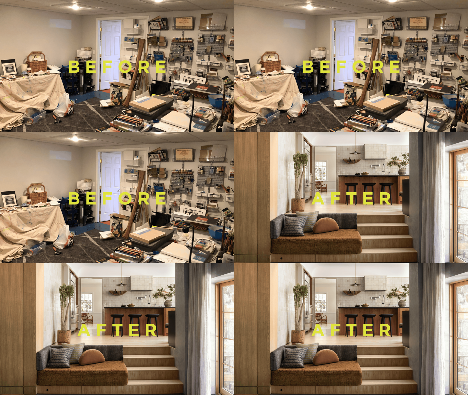
After — The new living room has a welcoming, cozy warmth.
Image credit: Jenn Verrier. Megan Downey
From the start, the client had a pretty clear image of what they wanted from the space. For Chris, the task was straightforward: "Create a light-filled, open modern kitchen with an integrated family gathering space."
Beyond that, the rest was left open for exploration. Bringing together an impressive group, with the team at Lyon Architecture, Megan Downey, and designer Emily Lindberg, there was no shortage of ideas.
Though it can be tempting to step into a renovation with an exact image of what you want your space to look like, it can often serve you better to step in with minimal expectations, to avoid the inevitable disappointment when things change along the way.
Instead of viewing these changes as a disruption to the plan, in this home, they saw the design process as an ever-changing, ever-evolving thing. "As is often the case with renovations, the concept evolved as we explored the home's existing conditions and worked through the design details together," explains Chris. "The result is a space that feels cohesive while still allowing each area to have its own personality."
While the exact design specifics were left open for the designers to interpret along the way, what was set in stone was how the renovated space was meant to feel. "Our primary goals were to bring order to the home's previously fragmented layout, make the split-level configuration feel purposeful, and create a more open, functional environment for the family," says Chris. Working against the existing layout, with its disconnected rooms and cramped spaces, was the starting point for this renovation.

"We wanted to create a dynamic relationship between the light, bright kitchen and the adjoining family room, which takes on a much moodier character through its dark plaster walls and more intimate atmosphere," says Chris.
When it came to developing the interior design style of the home, the team allowed the homeowners to lead the way. As much as you may want to put your trust in a designer and hand over all responsibility and decision-making to them, your home needs to reflect your style, and the right designer will take this into consideration when designing your space.
"The homeowners' interest in layering different textures and materials became a major source of inspiration," says Chris.
There was no specific era or style that they were hoping to emulate; the vision was of a more transitional style space, where various design movements and styles could sit alongside one another.
"Rather than adhering to one particular period or aesthetic, the project brings together several influences: the traditional character of the home's 1930s Tudor architecture, the warmth and expressive colors associated with 1970s interiors, and more contemporary elements through the millwork, textured countertops, and wide-plank oak floors. That mix gives the home a collected, lived-in quality rather than making it feel tied to a single design moment."
Beyond aesthetics, the clients also highlighted the importance of a hyper-functional home that could actually support their family. Reflecting this, Chris shares, "Storage was another important consideration, so we incorporated thoughtful built-ins and custom millwork throughout."
Ultimately, the design was about creating a balance between the functional and design aspects, creating a space that is as hardworking as it is inviting.
The Process

Before — The original dining room was overly formal, especially for this young family.
Image credit: Megan Downey

After — The bright kitchen has plenty of space for the family to sit around together.
Image credit: Jenn Verrier. Megan Downey
"The split-level configuration was arguably the home's most distinctive architectural feature, and we knew it was something we needed to preserve," explains Chris.
This multi-level living design was something they knew they needed to embrace, rather than shy away from. But, Chris tells me, "The challenge was finding a way to make the varying floor levels feel intentional and integrated rather than like an awkward remnant of a previous renovation."
The homeowners wanted the space to feel open and welcoming, and they were willing to knock down as many walls as they needed to get there.
Combining the kitchen and living room was one of the most important steps in achieving this goal. Using the basement level as the family living area, and the upper level as the large, open-plan kitchen, they had to find a way to create a feeling of connection between these two distinct floors, bringing them together to form one cohesive floor plan.
"Rather than trying to conceal the difference in floor levels, we embraced it and looked for ways to make the transition feel natural," says Chris. Adopting a more creative approach, the team decided to rethink how this connection could be made in a way that felt like more than just a transition between two rooms.
For this, Chris says, "Megan Downey Studio conceived the idea for an integrated bench alongside the steps, creating a visual and functional connection between the two spaces. Emily Lindberg then elevated the feature with custom upholstery and pillows, turning it into both a comfortable gathering spot and a distinctive design element."
This large, open connection between the two rooms, complete with a built-in seating area, allowed for exactly the kind of social, communal feel the family wanted for this space.

Simple joinery with curved edges made for a softer, more welcoming kitchen design.
As one might expect, this level of structural change was not without its challenges. "Opening up the previously divided rooms required significant engineering, including a substantial steel beam to support the roof and walls above the new family room opening, as well as multiple additional beams to allow us to remove walls in the kitchen," shares Chris.
Luckily, the collaborative approach adopted throughout this project only helped to reduce the stress of these complications. "By working collaboratively throughout the process, we were able to address the structural requirements while preserving the design vision and creating the open spaces the homeowners wanted."
But not only were they up against the challenge of a complete structural transformation, but there was also a limited time frame for them to get this all done within. With the homeowners planning to relocate from Vermont in just a few months' time, and wanting a finished home to move into when they do, time was not on their side in this renovation. "That meant making a considerable number of design decisions quickly, often while multiple aspects of the project were progressing simultaneously," says Chris.
As the design process continued, and the homeowners had some more time to offer to the project, some decisions were able to be revisited and adjusted. "That iterative process kept the entire team engaged and required flexibility, but it ultimately helped us arrive at a more thoughtful result."
The Design

Before — The basement rooms had hardly any light, leaving them feeling dark and crowded.
Image credit: Megan Downey

After — The banquette seating area was an excellent way to make the most of the space available.
Image credit: Jenn Verrier. Megan Downey
At the core of this renovation was the desire for a contemporary, modern home that maintained and respected the character and beauty of the original Tudor architecture. But while this sounds simple enough, finding a way to completely rework and restructure a home without sacrificing the original features along the way is no easy feat, and there often has to be some degree of compromise adopted when modernizing period properties for this reason.
"We wanted the interior to feel fresh and contemporary without creating a disconnect with the traditional exterior," explains Chris.
One way in which this was achieved was by ensuring the newly designed windows and doors were created with the home's original character in mind, taking care to develop a design that complemented the existing features,
"Inside, we embraced enduring materials such as wood, stone, and handmade tile, pairing them with cleaner lines, contemporary detailing, and subtle curves," says Chris. "The result strikes a balance between traditional craftsmanship and modern living."

The built-in seating area softens the transition between kitchen and living room, introducing a new function to elevate the stairs.
For the most part, this earthy color palette and focus on natural materials came about as a collaborative effort between Megan Downey Studio and Emily Lindberg. Instead, Chris and his team turned their attention to the architectural elements and structural work.
The home became a group project of types, with the three teams working alongside one another, allowing each other to exploit their strengths and let the others fill in the gaps of their weaknesses. "Megan developed the foundational finishes, including the wall, floor, and ceiling treatments," says Chris. "Her work on the tiled walls and the cove ceiling with integrated lighting helped establish the kitchen's bright, cohesive aesthetic. Emily then layered in the furnishings, fabrics, custom millwork, and accent lighting, bringing warmth, personality, and texture to the space."
While the kitchen, with its white, tile-covered walls, has a bright, welcoming essence, almost like a breath of fresh air, the living area adopts a different kind of color scheme, leaning into a moodier, more textural effect. This sense of contrast, Chris explains, was completely intentional, "giving the connected spaces distinct identities while allowing them to work beautifully together."
What makes this home feel so special is how rooted the design is in family life. Every decision and change was made with the vision of an open, social family home in mind, finding ways to create connection and cohesion across the space so that no matter where you were seated, you never felt isolated from the rest of the home.
The banquette dining area became a particularly pertinent example of that, even though it wasn't originally even a part of the plans. "They initially wanted a dedicated mudroom for everyday access to the backyard, but the available space simply wouldn't accommodate one. Instead, we extended the banquette and incorporated storage beneath the seating, creating a practical drop zone near the door where the family can put on and take off shoes, and the children can leave their backpacks," says Chris.
But what really makes this dining space feel so significant is the table; it was one of the few items the homeowners took with them from Vermont, cutting it down so that it would fit into this new banquette space. As Chris says, "Incorporating a piece from their previous home into the new kitchen was a lovely way to connect their past and present, making the space feel personal from the very beginning."
Shop the Look


If you're planning your own renovation project on an older, period home, projects like these can help lend you some inspiration, exposing just how vast the possibilities can be, no matter how awkward your space may at first seem. But if someone has already got there before you and done their own shoddy job of bringing new life to an older home, you may want to explore our tips for un-updating an ugly, modern kitchen in a period home.
And for more design ideas, subscribe to our newsletter.
