Sponsor Content Created With

Re-thinking White Walls — How to Make These Schemes Feel Rich, Modern, and Design Forward
There’s a difference between making white a default and carefully choosing a white paint colour with purpose, says Dulux Heritage Creative Director Marianne Shillingford

White walls are often dismissed as safe, plain, or lacking personality, but, in reality, the issue isn't white itself. After all, white isn’t a uniform shade — it’s a spectrum of near-endless nuances, each bringing something a little different to how a decorated room feels. Just take the Dulux Heritage colour chart for example.
From the light, elegant Linen White to a warmer neutral like Chiltern White, some bring warmth and cosy qualities, others feel cool, crisp, and contemporary. At the same time, different undertones take white, and therefore your walls, in vastly different directions. If you think that choosing white for a colour scheme means living in an uninspiring brilliant white box, think again.
But, it’s not just about the white you choose, but how you bring your colour story to life around it. Yes, white can hold power by itself, but in different combinations, from soft tonal looks to being bold with contrast, it’s a paint colour choice that still brings excitement and interest to a room.
So what can you really do with white?
To discover a little more about the options for using white in a decorating scheme more impactfully, Design Lab by Livingetc’s Iokasti Sotirakopoulou met with the Creative Director of Dulux Heritage Marianne Shillingford to talk about some of the brand’s most evocative white paint colours, and how to use them in different ways to give schemes a sense of elevated sophistication.

This room is colour-drenched in Chiltern White, a warm, off-white with plenty of character.

Whether you choose a tonal approach, or to add some contrast, Chiltern White is a versatile shade.
Firstly, take a look at your colour card. Taking Chiltern White as our example, it’s a tool that can help you create a soft, tonal scheme. “It’s surrounded by lighter and darker tones of colours from the same family,” Marianne explains, “which create this seamless, elegant, sophisticated look.”

Next, consider ‘committing’ to white. Colour drenching doesn’t just work with colour — using white across the walls, skirting, cornicing, architrave, and windows makes for a strong, confident look. “Commitment is what makes a great relationship,” Marianne says.
And lastly, think about contrast. “There’s a great phrase in design that says colour gets the credit, but contrast does the work,” Marianne explains. Choosing bolder, darker colours to sit alongside a wall colour like Chiltern White makes those tones jump forward, helping your scheme create real impact.

Ready to find your perfect white? Whether you're drawn to the understated warmth of Chiltern White or are inspired to explore the full Dulux Heritage collection, their online tools make choosing your perfect shade refreshingly simple – from seeing how your shade changes throughout the day (and night) to finding your nearest stockist to pick up a Dulux Heritage Colour Card or tester pot before making your final choice.
-
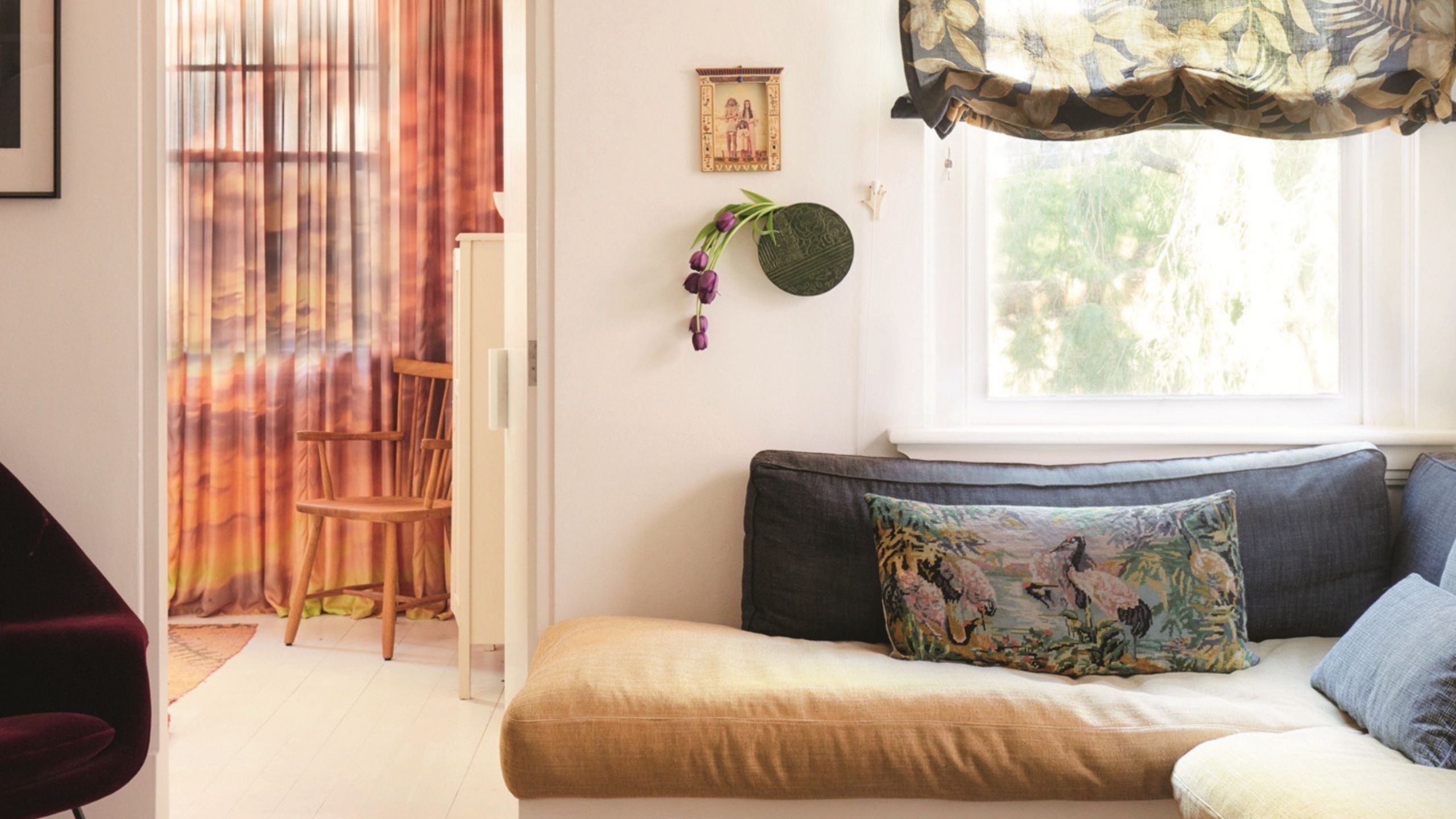 6 Modern Window Treatment Ideas That Don't Just Dress Your Windows, They Design Them
Filter the brightest sunlight without missing out on golden hour with some of the most creative window decor
-
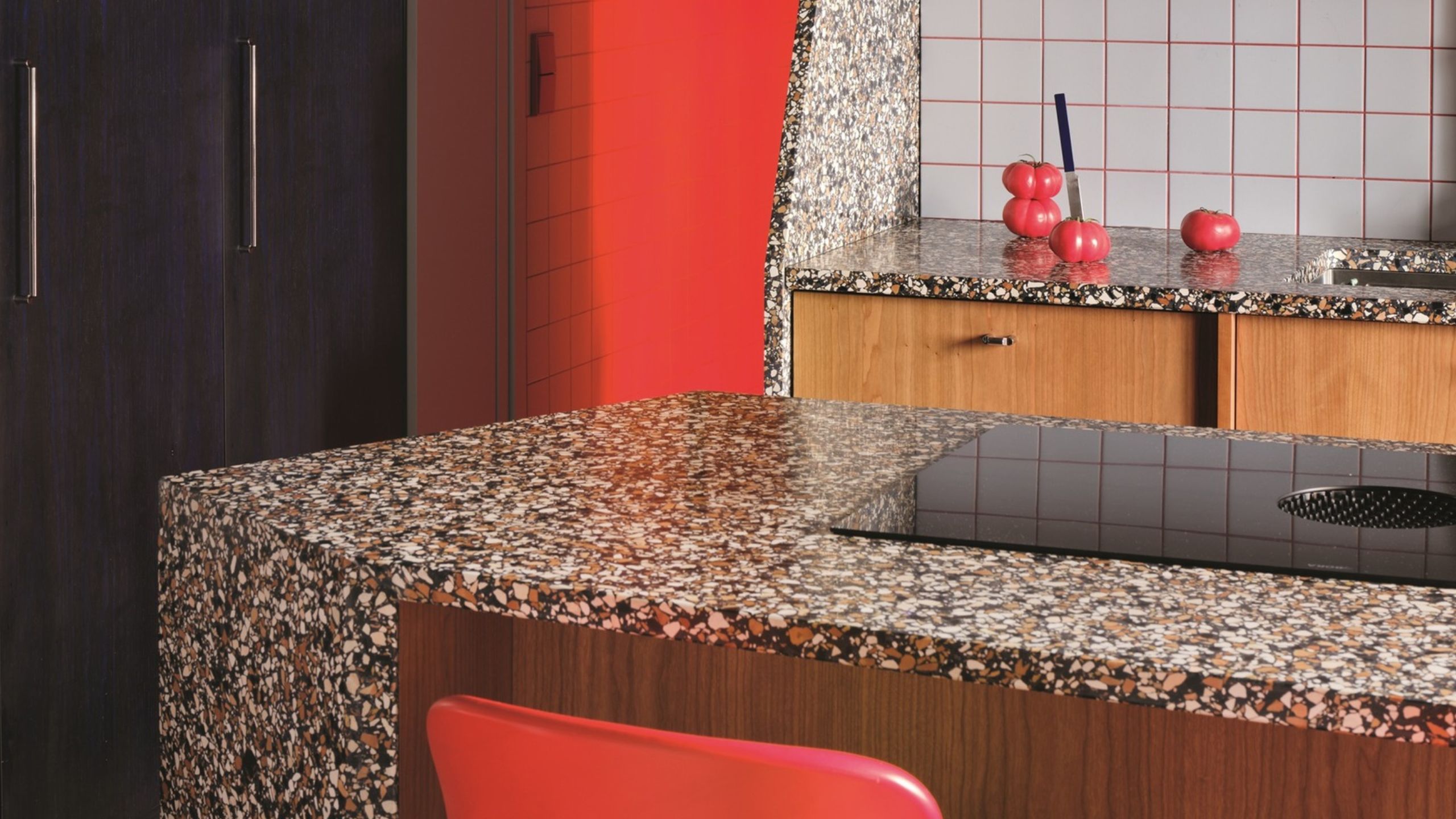 Designers Say Shapely, Angular Kitchen Islands Don't Just Look Good — They Can Improve the Flow of Your Space, too
Bold, angular islands have overtaken smooth, curved designs as the shapely kitchen look everyone wants

